Proof that the Cosby Show is the Greatest TV Show of All Time, and How TV and the Web are Trading Places
Recently I took a look at the Wikipedia page for Nielsen ratings and noticed that they list out the most popular show for each year. The most popular show is getting less and less popular every year.
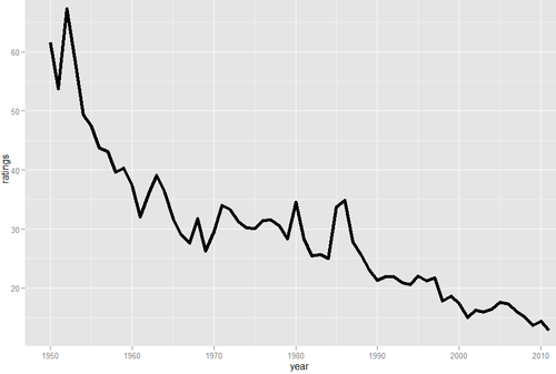
The top-rated show last year, Monday Night Football, had a rating of 12.9, which according to Nielsen means that 12.9% of US TV households watched, on average. The top rated show 28 years before, Dallas, had a rating of more than twice that, at 25.7. 28 years before that, I Love Lucy had a rating of about 50 (and an all-time high over 60 two years before that).
It looks like the Nielsen ratings of the top US show are roughly following an exponential decay curve. I did a quick fit using the nls function in R.
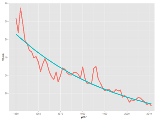
This gets a bit of a statistics caveat* but overall I feel like this is a pretty good sense of how ratings are trending. Based on the trend, by 2029, no show will earn a 10 rating, though frankly that might happen sooner. And if you really want to stretch the limit of time (and credibility) by 2100, no show will be watched by more than 2% of TV-watching households.
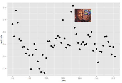
Below are some indications of which TV shows had the largest residuals: you can think of these as being the most off-trend. As you’ll see, the sweater reigns supreme when we correct for the era (using residuals in log points)
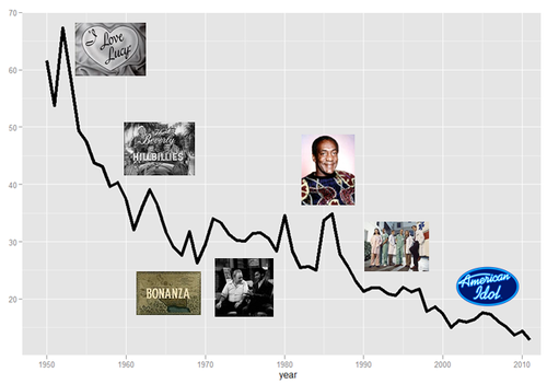
(all images from Wikipedia, except Cosby images which are from sfgate.com and funnyjunk.com, respectively)
So there you have it: The Cosby Show is the show that exceeded its era in ratings more than any other. It is the greatest ratings champion of all.

(allthingsd)
More seriously, I’m writing this a couple of days after Gangnam Style became the first YouTube video to hit 1 billion views. Granted, I work for a (great) tech company, but I think for a large portion of us, we’re more likely to talk about cultural events that we experience them through the internet than through TV.
When I think of cultural events that I personally experience through media, I think of the Super Bowl and paradigm-shifting news events. I remember being pulled out of class to watch the OJ verdict on TV in grade school. But now more of our shared political and cultural events are experienced together online. I didn’t turn on the TV when I found out bin Laden was dead, and I watched the Pacquiao-Marquez highlights online as well.
At the same time, segmented, niche communities are forming around TV shows. While shows are easy, it takes a larger mental investment now for me to DVR a program and keep up with it than it does to see the new thing online, since we’re so inundated with information. Watching a show live will be a source of pride and almost a status symbol in certain circles, like knowing a band before everyone else or getting a short username on twitter (disclosure- I work on loyalty programs. Sometimes for television programs).
I think the future of TV will look more like the web used to look- tighter niche interest focus and more interactivity, while the internet will serve more and more of the traditional roles of TV and major sites will continue to broaden focus.
*The first thing that jumps out at me here is that the set is auto-correlated (DW=.69). That’s a function of shows lasting more than one year, so the data isn’t truely iid anyways. I actually looked at residuals based on an autoregressive model, but it typically penalized shows that were popular for multiple years, which didn’t seem like a great way to determine the most popular show, IMHO. Anyways, I figured the gist of this is probably enough- TV shows aren’t reaching the wide audience they once were.
The West Wing

Tonight, Christmas 2012, my fiancé and I finished watching The West Wing for the first time, more than 20 months after we watched the first episode together.
We watched every episode together. 7 seasons. 156 episodes. Including a couple of double episodes, that’s 6,715 minutes of TV. 112 hours, or almost 5 days straight.
We started watching when my fiancé and I celebrated Passover together in April 2011. I proposed to her after we watched one episode and before we watched another. And we are finishing almost exactly a month before we get married.
I feel silly saying it, but I’m really proud that we watched ever minute together. It has been a constant in our relationship and a joy that I have looked forward to for many weeks.
And yes, for the record, I would recommend the show.
[gallery]
Indiana Jones Mystery Package
We don’t really even know how to start this post. Yesterday we received a package addressed to “Henry Walton Jones, Jr.”. We sort-of shrugged it off and put it in our bin of mail for student workers to sort and deliver to the right faculty member— we get the wrong mail a lot.
Little did we know what we were looking at. When our student mail worker snapped out of his finals-tired haze and realized who Dr. Jones was, we were sort of in luck: this package wasn’t meant for a random professor in the Stat department. It is addressed to “Indiana” Jones.
What we know: The package contained an incredibly detailed replica of “University of Chicago Professor” Abner Ravenwood’s journal from Indiana Jones and the Raiders of the Lost Ark. It looks only sort of like this one, but almost exactly like this one, so much so that we thought it might have been the one that was for sale on Ebay had we not seen some telling inconsistencies in cover color and “Ex Libris” page (and distinct lack of sword). The book itself is a bit dusty, and the cover is teal fabric with a red velvet spine, with weathered inserts and many postcards/pictures of Marion Ravenwood (and some cool old replica money) included. It’s clear that it is mostly, but not completely handmade, as although the included paper is weathered all of the “handwriting” and calligraphy lacks the telltale pressure marks of actual handwriting.
What we don’t know: Why this came to us. The package does not actually have real stamps on it— the outside of the package was crinkly and dirty as if it came through the mail, but the stamps themselves are pasted on and look like they have been photocopied. There is no US postage on the package, but we did receive it in a bin of mail, and it is addressed to the physical address of our building, Rosenwald Hall, which has a distinctly different address from any other buildings where it might be appropriate to send it (Haskell Hall or the Oriental Institute Museum). However, although now home to the Econ department and College Admissions, Rosenwald Hall used to be the home to our departments of geology and geography.
If you’re an applicant and sent this to us: Why? How? Did you make it? Why so awesome? If you’re a member of the University community and this belongs to you or you’ve gotten one like it before, PLEASE tell us how you acquired it, and whether or not yours came with a description— or if we’re making a big deal out of the fact that you accidentally slipped a gift for a friend in to the inter-university mail system. If you are an Indiana Jones enthusiast and have any idea who may have sent this to us or who made it, let us know that, too.
We know this sounds like a joke/hoax… it’s not (at least, from our end). Any hints, ideas, thoughts, or explanations are appreciated. We’ve been completely baffled as to why this was sent to us, in mostly a good way, but it’s clear this is a neat thing that either belongs somewhere else— or belongs in the halls of UChicago admissions history.
Internet: help us out. If you’re on Reddit (we’re not) or any other nerdly social media sites where we might get information about this, feel free to post far and wide and e-mail any answers, clues, ideas, thoughts, or musings to indianajonesjournal@uchicago.edu (yes, we did set up an email account just to deal with this thing).
The Triumph of Football, as Told by TV Ratings

(photo)
(disclosure- an NFL team is one of my clients)
Last night, the San Francisco Giants won the World Series, sweeping the Detroit Tigers.
Despite an awesome playoffs, ratings were way down this year. A big part of that is due to smaller market teams getting further in the playoffs, but I feel like the US is becoming more football-oriented each year.
To investigate, I looked at Nielsen ratings for the 4 major sports championship (NBA Finals, Stanley Cup, Super Bowl, and World Series) over the last 25+ years (less for hockey).
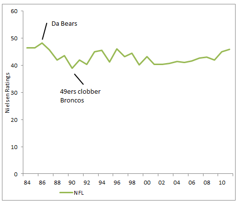
I thought Football would be running away with the ratings, but the Super Bowl has really just stayed stable in terms of ratings over the last few decades: the highest ratings in the time period were actually from 1986- when Da Bears shuffled their way to the Lombardi Trophy. Still, there has been a notable improvement in ratings over the last decade
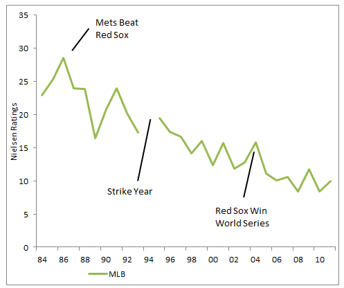
MLB, on the other hand, has seen a steady loss of ratings since the mid-80s. The average World Series game rating is about half what it was when this happened.
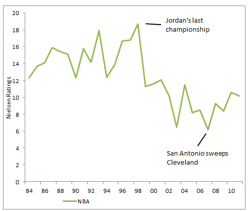
The NBA has also seen sliding interest, with a huge fall-off in viewership after the Michael Jordan Bulls broke up. It does seem like interest is picking back up though.
Here is the chart of all four sports. Sorry hockey- I don’t know enough about you to write anything interesting.
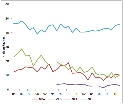
You can see the Super Bowl has always been more of an ‘event’ than the other sports finals. But even taking that into account, it is clear: we’re becoming more of a football country.
A Guide to Presidential Prediction Models
(image)
I don’t enjoy politics.
It’s a shame too. Politics has some of the best data and forecasting around. And great gossip and news. Every four years I take a look at the election and wish I could get as excited as my friends.
Through Lumesis, I had to follow elections and politics more closely, since it impacted our business. Now at CrowdTwist, I don’t interact with politics as much, but it still rears its ugly mug occasionally.
Predictive models, on the other hand, I can get into. And boy, are there a lot of them! Most of my friends love politics but have no interest in digging through political papers. So for all of you: here’s a cheat sheet for who is calling which candidate, why, whether it measures popular or electoral votes, and how seriously I take them.
Model: 13 Keys to the White House
Creator: Allan Lichtman
Who is this guy?: Professor atThe American University in Washington, D.C.
Learn about it: http://www.informs.org/ORMS-Today/Public-Articles/June-Volume-38-Number-3/Election-2012-The-13-keys-to-the-White-House
Type: Popular
Prediction: Strong Obama
Mudslinging: Nate Silver at 538 has a teardown.
How does it work?: Lichtman asks 13 ‘True/False’ questions (like ‘is the incumbent-party candidate charismatic?’). It’s best-of-13: if 7 are true, incumbent wins. If not, he loses. That’s it.
Big claim: it has correctly predicted the popular vote outcome of every U. S. presidential election since 1984’
Best thing about it: uh, it’s hilarious that anyone takes this seriously?
Worst thing: Lichtman counted Obama as ‘charasmatic’ in ‘08, but not this year. If that sounds like a reasonable basis for decision-making to you, I’ve got a whole bunch of facebook stock I’d love to sell you…
My thoughts: This gets press? Let’s move on.
Model: Time for Change Model
Creator: Alan Abramowitz
Who is this guy?: Professor at Emory
Learn about it: here
Type: Popular
Prediction: Slight Obama
Mudslinging: In 2008, Abramowirz donated the Obama and didn’t disclose it, according to Wikipedia.
How does it work?: The model combines Obama’s approval rating, recent GDP growth, and the advantages of incumbency
Big claim: The model has predicted share of the popular vote withing 1.1% for the last 4 elections
Best thing about it: Abramowitz has changed his model to account for the increased polarization in the US
Worst thing: Abramowitz claims that the results around the polarization adjustment ‘out-of-sample’, which seems like an aggressive claim
My thoughts: For what it’s worth, Abramowitz’s model seems hacked together. It’s no ‘keys’, but I consider its predictive power to be suspect.
Model: Presidential and Congressional Vote-Share Equations
Creator: Ray Fair
Who is this guy?: Fellow, International Center for Finance at Yale
Learn about it: http://fairmodel.econ.yale.edu/vote2012/index2.htm
Type: Popular
Prediction: Even/Slight Romney Edge
Mudslinging: Again from 538, the catty reality star of election modeling
How does it work?: The model is a best fit regression that takes into account a few non economic variables (are we at war? Is a sitting president running? etc) and adds in GDP growth, inflation, and the number of quarters of strong economic growth during the administration. Strong, consistent growth is good for the Prez.
Big claim: Fair claims his model has been right 21 or 22 times in the last 24 elections (that’s starting in 1916 for the English majors) depending on how you classify Bush-Gore. It missed badly with Bush-Clinton in 1992 and he counts 2000 as a miss too.
Best thing about it: Fair’s model is clear and rigorous: the math makes some intuitive sense even. And he’s got a handy calculator so you can see just how much you can effect the outcome by changing economic statistics here. Just like the Bureau of Labor Statistics does! (I kid, I kid…)
Worst thing: Fair calculates his model’s standard error at 3%, so the model doesn’t really tell us anything. Any it hasn’t worked well in recent elections. But other than not making a decision and then often being wrong when it does, it’s a pretty sweet model.
My thoughts: I am something of a Prof Fair fanboy- I really admire his work around aging in Sports and Chess. His election model is classic econo-physics: elegant and reasonable, but ultimately limited.
Model: Bread and Peace
Creator: Douglas Hibbs
Who is this guy?: Retired Academic, consultant
Learn about it: http://www.douglas-hibbs.com/
Type: Popular
Prediction: Strong Romney
Mudslinging: You can fit this in with the other 538 criticisms
How does it work?: Hibbs’s model is one of the simplest: how fast are incomes growing, and how many people are dying at war? With no war deaths, income growing at about 1% makes for a 50-50 election
Big claim: Hibbs doesn’t make huge claims: I have seen others say he claims 90% of variability in his model but I haven’t see the quote. He started releasing in 1992 and has had some misses but has been directionally right each time.
Best thing about it: It’s simple, elegant and it seems to work pretty well. Doesn’t get much better than that.
Worst thing: As 538 points out, Hibbs’s model shows extreme signs of ‘over-fitting’ or describing our specific recent experience instead of the underlying mechanisms. I think Silver is being a little unfair, but the point is well taken.
My thoughts: Hibbs’s model is really interesting and performs pretty well. It amazes me how well the data from 1952 to 1996 fits his model. Hibbs’s model likes Romney’s odd the most, giving him about a 90% chance of winning
Model: History and Primary
Creators: Helmut Norpoth and Michael Bednarczuk
Who are these guy?s: Professors at Stony Brook and UW-Milwaukee
Learn about it: http://journals.cambridge.org/action/displayAbstract?fromPage=online&aid=8700583&fulltextType=BT&fileId=S1049096512000868
Type: Popular
Prediction: Strong Obama
Mudslinging: No one really pays attention to this model, apparently
How does it work?: Norpoth’s model counts incumbency and how the two candidates did in the New Hampshire primary: larger percentages of the vote in the Granite State in January correlate with a win in November.
Big claim: That New Hampshire matters.
Best thing about it: It’s a great excuse to listen to Granite State of Mind
Worst thing: It suggests that the leader of the free world is chosen by a bunch of burly dudes fishing Lake Winnipesaukee and their wives
My thoughts: History and Primary believes in Obama the most, giving him an 88% chance of a win. Also, oh my lord I hope this logic is wrong.
Model: State Level Economic Indicators
Creators: Kenneth Bickers and Michael Berry
Who are these guys?: Professors in the University of Colorado System
Learn about it: http://www.colorado.edu/news/releases/2012/10/04/updated-election-forecasting-model-still-points-romney-win-university
Type: Electoral
Prediction: Strong Romney
Mudslinging: Probably just me, below
How does it work?: Like the Fair model, this model depends on economic inputs (income and unemployment), but it instead uses them at a state-by-state level to call each state. The authors look at previous year vote splits to set a baseline for each state.
Big claim: would have predicted how 90% of states have gone (and 100% of presidential winners) since 1980
Best thing about it: The model seems to make sense in theory, and provides specific scenarios. It has Obama losing Ohio and Florida badly- Wisconsin becomes the new swing state due to Paul Ryan’s involvement.
Worst thing: This model is conservative, assuming that states lean the way they have in the past. Given that, Bickers and Berry are going to miss any surprises or changes in a state’s electorate.
My thoughts: I’m pretty sure this model is massively overfit. Using 13 variables to predict 8 elections guarantees that there are no remaining degrees of freedom- I would be shocked if they hadn’t predicted previous elections! The authors would argue that there is more uncertainty due to 50 states, but based on correlations between states I would never consider them to be independent. I would expect this model to perform slightly better than the Fair model since it’s electoral, but very similar
Model: The Jobs Model & The Proxy Model
Creators: Michael S. Lewis-Beck and Charles Tien
Who are these guys?: Professors at the University of Iowa and Hunter College
Learn about it: http://journals.cambridge.org/action/displayAbstract?fromPage=online&aid=8700619&fulltextType=BT&fileId=S1049096512000984
Type: Popular
Prediction: Romney and Obama. Wait, what?
Mudslinging: uh, themselves?
How does it work?: Not to be outdone, Lewis-Beck and Tien have two separate models that they use, both regression models. The Jobs Model looks at presidential popularity, economic growth, jobs growth, and incumbency, and is what they are better known for. The Proxy Model depends on business sentiment. Right now, the Proxy Model leans towards Obama, while the Jobs Model shows Romney ahead.
Big claim: At the point where you feel compelled to build a second model, you probably aren’t claiming crazy results with the first one.
Best thing about it: Both are simple models that look to mix sentiment and economic data- the business sentiment report is really a poll in economic data’s clothing.
Worst thing: The Jobs Model nailed 2004, but was way off in 2000 and 2008. Maybe it works best when a sitting president is running.
My thoughts: Given the poor results in the last few elections, I’m skeptical. The reasoning behind the model makes sense, but I suspect it doesn’t work better than just forecasting using presidential popularity alone.
Model: Leading Economic Indicators and the Polls
Creators: Robert Erikson and Christopher Wlezien
Who are these guys?: Professors at Columbia and Temple
Learn about it: http://journals.cambridge.org/action/displayAbstract?fromPage=online&aid=8700589&fulltextType=BT&fileId=S1049096512000881
Type: Popular
Prediction: Strong Obama
Mudslinging: nobody, really. Even Nate Silver thinks these guys do good work.
How does it work?: It uses the index of leading economic indicators (if you aren’t familiar with economics, this is a known index that comes out quarterly), along with the most recent polling data.
Big claim: Using data from 1 quarter before the election, the model has gone 13/15 since the 50’s. Also they think that debates don’t make any difference in the election.
Best thing about it: You can bring it up to political scientists without getting laughed at. These guys have great reputations.
Worst thing: Trying to pronounce Wlezien. Also, since they use quarterly data, they lag behind everyone else on updating: they are still using economic data announced pre-convention.
My thoughts: The LEI+P Model likes Obama’s chances, giving him an 80% shot. But this model has over-estimated the incumbent party vote 4 elections in a row (thought within margin of error). That’s probably just coin-flip noise, but it does make me a little hesitant.
Thoughts from India

I am recently back from India, and while this is deserving of a much larger post, I thought I’d post some things that were top of mind.
The future is already here – it’s just not evenly distributed
All over India, I couldn’t help but think of the famous William Gibson quote. The level of inequality in the country is hard to prepare for. Amazingly, by Gini coefficient, India isn’t particularly unusual: it exhibits equality if anything. But that’s mostly because…
There are SO many people
I think intellectually everyone realizes that there are a lot of people in India. I mean, duh. But I didn’t appreciate it until I was there. The list of cities by highest density is dominated by India, and if anything this understates the situation: if you restrict it to cities with more than 1 million, six of the top nine are in India.
Practically, this means that there are ALWAYS people around outside. Living in NYC, I tell people that every street in the cities is as crowded as 3rd Avenue: not a crush of people like Times Square, but always, always people around. And you can drive 50 miles on a highway and see that kind of density for almost all of it. It is staggering.
The differences within India are much more than I expected
I went to India expecting pretty-much everyone in a large city to speak Hindi (the national language) and maybe English. I was way off base. Less than a quarter of Indians speak Hindi natively, and only about half really speak it at all. The rest of the country speaks in what I guess you would call ‘regional languages’, but at this scale they aren’t regional. There are more native speakers of Punjabi than German. More of Telegu than French. More of Marathi, Tamil, and Urdu than Italian.
Beyond language, the differences between North and South in religion, food, and ethnicity were way beyond what I was expecting.
Security is a huge concern, but the country is safe… generally
Living in NYC post 9/11 and having been to Israel several times, I am used to fairly tight civilian security. But Pakistan is sponsoring terror attacks in India, and security is really tight as a result.
That said, I felt very safe in India (though traveling with family makes it easy). We did drive through a damaged toll gate in Bangalore, however. When I made I comment about it, I was told that an angry mob had broken it in protest of the toll. Not the answer I was expecting.
The Taj Mahal is empty on the inside
A silly point, but I was surprised. I had never thought about the inside, but you look at it and forget it’s a tomb. There are basically two dead people in there and that’s about it. WYSIWYG, indeed.
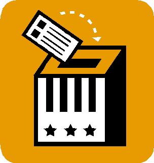
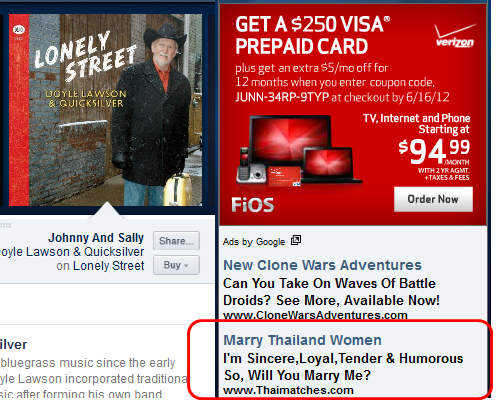
What does taste in music say about who we want to date?
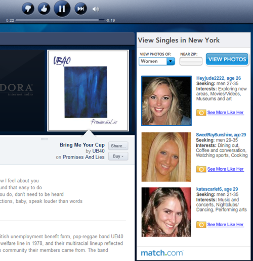
Anyways, I didn’t really think anything of it at the time. But look at the girls: they’re pretty uniform in appearance: white, in their 20’s, with straight hair. And though Match has plenty of pictures of attractive women, they kept on showing me pictures of girls that pretty-much look the same as these girls.

I didn’t even realize I was being profiled until a few months ago. I went to a Punch Brothers concert and created a few bluegrass and country stations. I also downloaded the android app.
Immediately after downloading the android app, the Match ads changed.

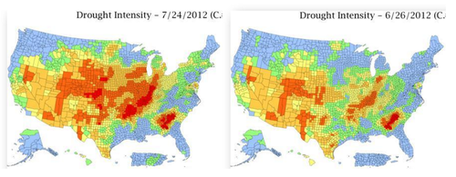
Drought
My old compatriots at Lumesis are producing the clearest maps around of the awful drought conditions covering 40% of the arable land in the US. Droughts are always under-reported stories: they are classic ‘slow-onset’ disasters without the visuals of fires or earthquakes, but the disruptions cover wide areas.
Gregg did a quick write-up you can read here.