The Dashboard Lifecycle
I once asked my brother, who studied large organizations, what was more effective- the hierarchical, top-down organization of, say, Apple, or the distributed decision-making of, say, Urban Outfitters.
My brother said “both”.
Apparently, the best way to capture the benefits of hierarchies (order, coordination) and delegated authority (reaction speed, creativity) was to cycle between the two. There was generally no single best system for any one organization, not even for very large organizations with stable missions.
Change was best. Even though it imposes high switching costs, change is best.
That conversation occurred to me this week as I looked at the dashboard that I provide my team, updating them on the state of our business. My dashboards generally shift from being very simple to being much more complex, until we all agree it’s time for a different look and we burn them down again.
Now I’m starting over again with a new dashboard, and I’ve realized that this process has repeated itself enough that I really recognize a cycle, which I’m calling, super-creatively, ‘The Dashboard Life-Cycle’. It goes like this:
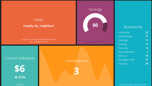
Creation: It starts very simply. “What are our three top priorities or KPIs and how are we measuring them?” A first cut of a dashboard might be as simple as 3-5 numbers, tracked over time. People look at it and say “That will do for now, I guess”. I always think of the dashing demo as a fine example of a dashboard in this stage.
This stage usually lasts only a month or two. It doesn’t take too long before your data consumers start asking things like “Is that number good or bad?” and “How does that compare to last year/our goals/our competitors/industry average/whatever?” So then you move to the next stage…
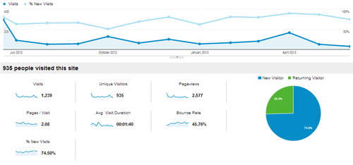
Context: Contextual dashboards are heavy on the line-charts and bar-charts, depending on whether you’re comparing your product to last week or to the competition. The iconic Google Analytics chart has about 130 data points on it and is a pretty good example of a contextual dashboard.
People look at it and say “That will do for now, I guess”. But this level of analysis can take an organization a long way, illustrating trends or market strengths clearly. However, your data consumers realize that these charts aren’t really giving them any idea why numbers are up or down, or why you’re gaining or losing market-share. So they ask “What’s driving this change?” or “How can I tell what segments are we lagging with?” are typical questions after looking at a board like this. So we move to stage 3…
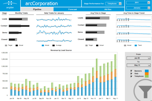
Category: In category or segement dashboards, the constituent parts of your numbers take center stage. Here you’re no longer looking at the company’s top priority numbers from the first stage unless you’re summing up the different groups somewhere. Mostly you’re looking at different groups to see if there are any outliers. I usually see 250 or so data points on these dashboards. To give a sense of complexity, this dashboard is a pretty good example.
This is where you start getting to the point of needing to sub-divide the dashboard into different views. People can only interpret so much data at once. Some data consumers start to tune the dashboard out at this point, instead just coming up and asking about info that’s readily available on the board. Others are really unsure about what is included in one group versus another (ie “When does someone move from lead to contact?” “How do targets fall out of our funnel?”). People who aren’t really paying attention look at it and say “That will do for now, I guess”.
At this point you’re probably better off just burning down to a simpler board. But occasionally, you’ll have data consumers that want the highs and lows highlighted, or some additional number added in. So you move to the final stage…
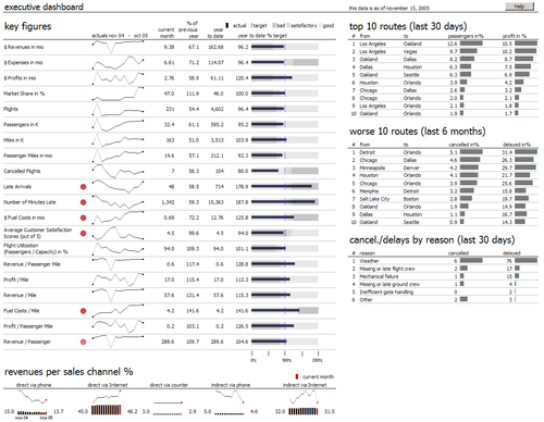
Chaos: This is the deluxe, extra-coffee-holder-and-seat-warmer version of a board. Here’s one with well over 400 data points on it. Multiple displays of the same data points, sparkline abuse, and tiny type are all signs of a dashboard deep in the Chaos stage.
Only the most dedicated consumer can make it through this. You’re frequently asked about what is going on, what the numbers are, and “Is there a summary or something?”
So you start over. And the cycle begins again.
Can I fix this? Should I fix this?
For a long time, I was frustrated with the amount of time I spent conveying metrics to my team. I have wondered if there was a better way to approach these displays (and I’m sure there is one). But I’ve come to appreciate that cycling my dashboards, while costly in terms of time, is actually valuable in terms of my team’s understanding of what’s going on, for a few reasons:
Avoid Habituation: If there’s an email I get every week, or a monitor I pass every day, after a while I start to tune it out. By shaking things up, I can keep things a little bit fresher and get a lot more engagement from the team.
Easier to Try New Things: With the expectation that the dashboard will be replaced every few months, there is lots of opportunity to look at new indicators and see how they trend over time. I often think that KPI selection is heavily path dependent, so multiple opportunities to look at trends gives you a much better chance of really finding some insight.
Less Sensitive to Criticism: This may be unique to me, but I know that after I work on a project for a while, I get cranky when people nit-pick or ask me to add things. By making each iteration of my dashboard lower-stakes, it’s a lot easier for me to openly and honestly assess what is working and what is not, and the make changes accordingly.
And after all, change is best.