
When to Avoid the Subway - PyGotham 2017 Talk
My name is Josh Laurito, and I'm here to talk to you about the intersection of three of my favorite things: python, New York City, and trains.

My name is Josh Laurito, and I'm here to talk to you about the intersection of three of my favorite things: python, New York City, and trains.

A couple of quick things before we get started:
One is that this talk is a little more Gotham than Py. I’ll be talking a bit about the tech I used here, but if you’re looking for something that will help you once you actually get to work, you might be happier in one of the other talks.
The code and data for this talk are available on Github if you’re curious.
The full text and slides of this talk are available at my website, blog.joshlaurito.com, so if you want to follow along there or catch up because you were distracted by twitter & missed one of my pearls of wisdom, you can do that. I also have posted a link to this talk on my account: @joshlaurito.
Also, a quick plug: I have a weekly email about the data & analytics community in New York City, highlighting events, jobs, and some of the great posts that are written by members of our community. You can check out the archive at tinyletter.com/nycdatajobs, and if you find it to be interesting, you should sign up.
Ok, on to the talk.

The NYC Subway
Most of us who live in the city take the subway everyday, and the decay of the subway has become part of our normal routine. But for those of you from out of town, let me give you a quick introduction to the system.
The NYC subway first opened in 1904 with 28 stations. This is a picture of the construction of one of the original stations, Columbus Circle, about 4 years before opening.

Today, the system contains 422 stations (as we commonly think of them, the MTA counts more), spread across about 23 lines (depending on whether you include the Staten Island rail and if you differentiate between the multiple ‘shuttles’ or S lines, and if you differentiate between the J & Z lines, which are now the effectively same train).
The system includes about 6,400 subway cars, making over 8,000 trips per day, totalling about 1 million miles per day. With the opening of the Second Avenue Subway this January, there are more than 665 miles of track.
5.7 million people take the subway on an average weekday: in 2016, 1.76B rides were taken.

The map you see inside of the subway stations is actually a very accurate display of the system: other than a general widening out of manhattan, trains move in the direction you see on the map. In general, lines that go North-South are longer than the lines that go East-West. The longest line is the A train, which makes 66 stop along over 32 miles of track.
The Problem

Unfortunately, the subway has been getting worse over the last few years, by almost any definition or metric you’d want to use. The MTA, to their credit, posts a number of different stats online in order to be publicly accountable for what’s happening.
Here is a graph of the On-Time Performance of the lines over the last eight years. A train is considered late if it makes it to the end of its route more than 5 minutes after the anticipated time, or if it skipped a stop. That’s admittedly a pretty strict standard, but the performance is abysmal. The main IRT lines (those are the numbered lines) have on-time performance as low as about 30%. By the way: this chart and all the charts in this presentation were produced using Bokeh. This is my first project using Bokeh, and I’m blown away by it: would highly recommend.
While the MTA, which operates the subways, as well as local buses, commuter rail, and bridge and tunnel operations, should be lauded for making this information available, it doesn’t actually provide us with a lot of guidance around what we can do to make our commutes better, or to make sure we’re on time for things. But the MTA does provide a lot of information that’s updated in real-time or near-real-time: they have a very well laid out developer page with a list of resources, and so potentially we can use it to make better decisions about when we can expect the subway to be working, and when we should leave extra time.
One of the data sources is an XML endpoint that updates with major service change status, updated every minute. This is great for up-to-the minute status checks, but there’s no history stored in an accessible location.

Another source is the GTFS feed. GTFS, which stands for General Transit Feed Specification, is Google’s standard for ingesting transit data.
The feed itself is somewhat difficult to work with, since it requires data to be sent as a Protocol Buffer. Let me take a quick minute to talk about these.

Protocol buffers are a standard for serializing data. They originated as google’s internal standard for storing and transmitting data. They’re most similar to XML in that the data they encode is inside of a highly specified, tree-like structure, but they’re much smaller since they aren’t encoded as text, so they’re appropriate for highly-concurrent applications.

Unfortunately, they are not human-readable and are not at all well suited for doing exploratory data analysis. Fortunately, since Google treats python as the first-class language that it is, the python protobuf library is part of the core protobuf project, so support is extremely good. If you’re considering working with the GTFS feed, I’d strongly consider that you convert all the data to JSON before attempting to work on it.

However, if you do manage to get to the GTFS feed, there are a few issues. The primary one is that there isn’t a lot of historical data: the city started saving this information and kept it up for several months in 2014, but discontinued the project. And you’ll need to find the city’s .proto spec if you’re going to decode the information. It’s available, but difficult to find: I’ve posted a link in the github project for my research.

The city’s implementation of GTFS is kinda wonky. Here’s an excerpt, converted to JSON. Not every train is identified every trip, and stalled trains don’t send any signal, making it very hard to identify when there’s an issue. You might notice if you squint that arrivals and departures are listed with the same time. Also, if we’re hoping to do long-term historical research, the data just isn’t there. One committed civic hacker had a system up to pull in the data, but only ran the server for a bit over a year before stopping. I’ve been pulling in this data every 10 minutes or so, but I don’t want to wait years to be able to start the analysis.

Which brings me to the My MTA Alerting System.
In late 2008, the MTA announced a program to send emails & text messages to subscribers about unplanned service disruptions. This program has been reasonably popular and has been maintained for almost a decade. So as a result, there is a record of every major service disruption on the Subway, the bus system, the LIRR, MNR, and bridges and tunnels.

The great thing about this system is the volume of the data that’s in there. over the last 9 years, the MTA has sent over 450,000 alerts, which are crawlable! Over 100,000 are related to the subways: slightly more are related to buses and the LIRR, which from what I can tell are less reliable systems.

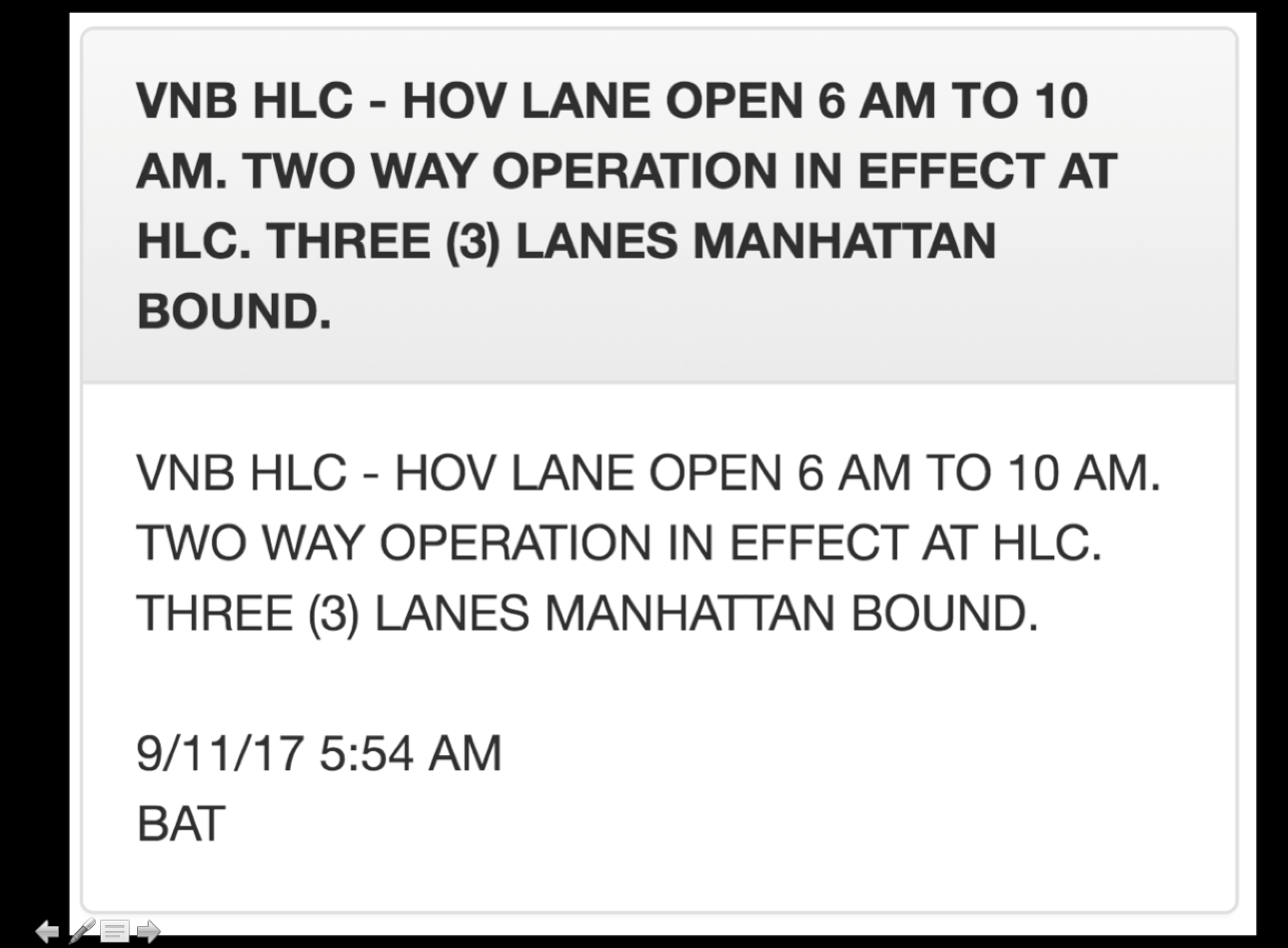
Just to prove it worked, the MTA sent a signed message announcing the creation of the program. This shows the structure of the alerts: they have a title, a message body, a timestamp and a system reference, which tells us which system it’s referring to. All of these have been stored online and are accessible.

Going through the alerts when you aren’t trying to go anywhere is actually a lot of fun. As someone who’s lived here for a long time, lots of things that I’ve lived through and seen are encoded here. Most long time New Yorkers will recognize this alert as relating to the night when all the Thanksgiving Parade balloons get blown up, which most long time New Yorkers will also tell you is the one of the best things to see in New York.

Also, like you’d expect from such a large corpus, you’ll see all sorts of weird and non-intuitive messages. This one is one of my favorites. I initially thought this was referring to some lesser known catholic feast, but I can’t find any reference to that, so I have no idea what was happening.

Probably my favorite thing about the alerts, though, is that inexplicably the Bridge & Tunnel alerts are always in all caps. Which is just perfect.
Anyways, so, on to the Python part of this. I built a simple web-scraper to pull all of these alerts down, with an initial pull going about 3 years back: I engineered a number of features, primarily to help me extract which lines are impacted by each alert, and whether the alert was new or an update, whether it was letting people know about a planned change or an unplanned emergency or a non-service change, like the elevators being broken.
After cleaning the data, we want to do a quick sanity check on whether the data we have is any good. So I looked at the relationship between these alerts and the ground truth over the last 3 years: MTA’s on-time performance. So this a chart of on-time performance vs. the number of disruptions. Number of disruptions is on the x axis, and the on-time performance is on the y axis. The number on the charge is the coefficient of correlation, or R-squared.
Fortunately, the relationship between these variables is extremely strong! Across the 20 lines that have been under continuous operation, the average correlation between the number of alerts and on-time performance is about -0.5, and all trains but one have the expected relationship of more disruptions = more delays.

The two major exceptions to this trend were the R & 6 trains, which required some investigation. The R train underwent 2 major changes to service over the 3-year time-period. Before fall 2014, the R had operated in two distinct sections for over a year as repairs were made on the Montague tunnel. Then, late last year, late-night R service was extended to Whitehall street, which allowed the R to avoid some problem spots in queens. You can pretty clearly see the impacts of the service changes on the R.

I don’t have as clear of an explanation about the 6 train, and why it’s an outlier. I believe this is due to the 2nd avenue subway line opening early this year, which was primarily designed to take pressure off the 6. So while the rest of the system has gotten worse this year, the 6 is slightly better. As a regular rider of the 6 train, that seems like a reasonable explanation. An alternate hypothesis would be that *no matter what happens in the system, the 6 will probably be late*, which I have to admit is also a pretty compelling theory.

Looking at system-wide disruption also gives us a nice way to measure the system performance on a day-by-day basis. Here’s a graph of day-by-day performance in terms of the average number of disruptions, along with the 28-day moving average. You can see some spikes in the winter, which after investigation, I can tell you are due to snowstorms.

At this point, we need to do some more classification. I engineered some additional features to try to get at the cause of each alert. Fortunately, Scikit comes with a ton of classification tools: I used a decision tree on top of some heavily engineered features, and then I manually classified a little bit over 1,000 alerts to train the model, and then validated on an out-of-sample selection, which was classified with 96.9% accuracy.

So now we can look at the performance of the subway over the last 36 months, with the impact of bad weather pulled out. Like before, this is the daily number of disruptions, with the 28 day moving average in bold. We can see pretty clearly that the system has been dealing with more disruptions, jumping from an average of about 15/day over the last few years, to about 22 since late last year. That’s roughly a 50% increase in disruptions. We aren’t just imagining things, the trains really are worse.

So now that we’ve identified weather as driver of performance, we can look at how precipitation impacts the trains. I pulled daily weather information from NOAA and regressed it against performance. The relationship is rough linear, and every inch of precipitation results in about 5 additional disruptions per day, or the first inch of rain leads to about a 30% increase in disruptions compared to a dry day. The relationship isn’t incredibly strong though.

There’s a much stronger relationship when we look at snow: here we see that each inch of snow leads to about a 10% increase in disruptions compared to a dry day. I also took quick looks at cold and hot weather: there’s a slight association between cold weather and delays, nothing meaningful for hot weather, though.

So one cool thing that also comes out of this is this is that we can now see a breakdown of all the causes of delays on the subway to a fairly high level of accuracy. So here’s my obligatory jupyter notebook screenshot/reference. Excluding some delay types we don’t care about, like non service announcements, on an average day, over the last three years, the system sees about 18 disruptions per day. The most common causes of delays are general equipment problems and signal and switch problems. Sick customers, police activity, and maintenance make up the other very common disruptions.
If you’re reading closely, you’ll notice that I’m breaking out ‘end of disruption’ alerts separately: occasionally the city will only announce a disruption after it has passed, which I am classifying slightly differently.

Anyways, another nifty thing we can see here is a relative ranking of how bad each disruption is, estimated by the number of alerts & updates that get sent for each one. The MTA sends updates roughly every two hours for ongoing disruptions, so as a very loose rule of thumb, I think of every update as representing an issue open for two additional hours. You can see that ‘construction’ is far and away the worst, which might be confusing, but what I mean here is road construction impacting shuttle buses. So these are situations when you’ve already transferred to the bus, and then the bus is rerouted by construction, as you can see in some selected messages on the right.
Unplanned service changes, weather disruption, and accidents (which usually mean someone hit by a train) take a long time to resolve. Sick customers don’t take too long to get off the system though.

So finally we’re really in a place to think about when to avoid the subway. The first thing I looked at is when the most disruptions occur. Here’s a heatmap: darker colors mean more disruptions. Turns out that the worst time for the system is Monday morning, between 8 & 9AM. On weekdays, disruptions primarily happen between 6 & 10 AM, and between 3 & 7PM in the afternoons. Fridays are by far the easiest day of the week.

Putting this data another way, on Monday mornings, there is an 80% chance that there will be a disruption somewhere in the system in any given hour. That falls to about 20% by the middle of the night.

Pretty clearly, there is a direct correlation between the number of people on the system and the number of disruptions. This makes sense for a lot of disruption types, like sick passengers and overcrowding, but also applies to things you wouldn’t expect. Here’s the chart for equipment problems by hour: you’ll see that though we wouldn’t necessarily expect equipment to always break down during rush hour, our disruption announcements do. This gives me some level of concern about the quality of the dataset, though if we’re missing slight disruptions that happen late at night I think I can live with that. I mean, if a train stalls in the middle of the night and no one is on it, does it really create a delay?

Unfortunately, since most of the disruptions follow a very similar pattern of being worse early in the week and in the morning, there isn’t really much to say about the relatively likelihoods of each of the delays. There are two exceptions though:
Maintenance windows clearly happen off-hours. Even when the MTA needs to do unplanned work, they obviously strive to avoid working during peak hours.

The other main exception is with sick customers. It’s a little hard to see, but sick customer delays become more common later in the week, with Thursday and Friday afternoons being slightly heavier than earlier in the week. On Fridays, every hour from 1PM to 7PM, there’s about a 20% chance that there’s a sick passenger causing a delay on the system somewhere. I’ll leave it as an exercise to the audience to figure out why.

We can even go a little deeper and see which disruptions are likely to happen on each line. Here’s a heatmap of disruptions by line for the major causes of delays. While again we see the same pattern in the data, there are some identifiable differences. Delays on the L are dominated by equipment problems, and the very similar 7 train deals with the same. My 4/5/6 deals with sick passengers the most, maybe because it serves the Bros of Murray Hill (which I say with love, having been one). The F train in particular suffers from signal & switch problems, while the J/Z, G and 1 trains seem to be pretty reliable day-to-day.

Probably the most interesting thing I’ve found so far, though, and what I’m continuing to research, is how delays cascade throughout the system, from one train line to another. Obviously trains that run on the same line will share a lot of delays: if there’s a problem with the 4, it will usually impact the 6 in some way. However, in the outer Boros, there are a lot of trains that run together differently than they do in Manhattan. As a result, from a Manhattanite’s perspective, there is some ability to predict issues on what seem like unrelated lines. The E & F, for instance, don’t run together at all in Manhattan, but they do share a line in Brooklyn. Fairly often, when there’s an issue with one of them, the other will reflect this and will be disrupted not long after, and this does have some predictive power.

Unfortunately, that’s about as far as my research has taken me, as of now. I continue to look at different ways to model expectations of delays, but currently I haven’t been able to do better than about 30% accuracy, as measured by correctly predicting which line will have an incident in a given hour. It is the final irony of my work on the subway that I’ve spent hours on it, going nowhere or slower than I hoped.

Still I promised to give you some advice that you can use to make your commutes slightly better. And I do have the data to give a few simple pieces of advice. If you’re going to choose a day to stay home bc you can’t stand the commute, always choose Monday. If there’s an unplanned service change, stay away from the line for the rest of the day, but stick around if there’s a sick passenger or police activity: those resolve quickly. If you can stay home when there’s more than about 2 inches of rain or 5 inches of snow forecast for the day, you probably should.

And definitely sign up for alerts: if you can’t know about delays ahead of time, at least you can know about them in real time.
Thanks a bunch for listening, and safe travels.
Moving to Gawker Media
 I'm super, super excited to post that I just completed my first full week at Gawker Media. I'll be acting as Head of Data & Analytics for the company, primarily helping to improve their kinja platform but also supporting the editorial team at their media properties.
Any work-related findings or posts will be at the (brand new) Gawker Data Team blog: gawkerdata.kinja.com.
Final Projects
 Late last year, I agreed to teach a master's course in data visualization at the City University of New York.
In a closely related story, my blogging dropped to zero over the last few months.
Anyways, the class was a great experience, and I think the students did an awesome job on their visualizations. You can see the full list of projects here.
Mapping the US Banking System with D3.js
 I snuck in one last data project for 2013: a d3 interactive map of the US banking system. You can play with it here. Please do and let me know what you think!
I was really happy with how the project came out. I also was really happy with Github Pages, which I tried out for the first time with this project. If you ever work with git, I can't recommend it enough. I'm hoping to move more of my projects there in the future.
A Startup's Minimum Revenue Per Employee
 In a couple of weeks I am going to be teaching a class on Data Visualization for Businesses (you should come!) and as part of the class prep I started thinking about key metrics that my students may want to visualize.
After weighing some of the options, I settled on Revenue Per Employee, which has been on my mind recently. I want to understand what is the minimum revenue per employee that quickly growing companies can sustain?
I decided to put together a quick plot of a few key stats based on the 2013 Inc. 5000 List. You can play with the interactive chart here. In his excellent SaaStr blog, Jason Lemkin points out that everybody lies about business info, but agrees that this data is probably in the ballpark.
I took all of the data and threw it into a Google Motion Chart, which I find to be the easiest way to quickly inspect data across a bunch of different dimensions (though not as pretty or powerful as d3). I only included Advertising, Media, and Software companies, since I believe their major expenses are people and many of those start-ups are pulling from similar pools of people.
Google Charts lets you easily play with which data is displayed on each axis, so it's easy to look at the data a bunch of ways. First I looked at Revenue Per Employee vs. Number of Employees, but all this showed was that some of the companies are either really crushing it or may need to reconsider their reporting.

I played around with the data in a few other combinations (you should too here). There's plenty of interesting stuff in the data. For example, you can clearly see the $2 Million revenue cut-off to get into the list when you look at revenues per employee.  The graph of revenue per employee below shows that the average fast growing company in these areas is generating $230k - 310k per employee in revenue. For fast growing companies with over $2 million in revenue, that seems to be fairly consistent no matter how many employees the company has. But software companies (in yellow) lag far behind the other industries on this metric: they typically generate 25% fewer revenues per employee, and a few smaller ones are operating on under $100k per employee. I believe much of that is due to the increased interest in funding software companies over the last few years (allowing money-losing companies to grow), though some might also be due to lower operating costs.

This is actually the exact opposite of what I expected. I assumed that software companies would be more scalable and generate more revenue per employee, but the numbers don't bear this out.
You can see all the code here. Follow me on Twitter if you're interested in future projects/posts.
Chicago's Finances
 I wrote a guest post on Chicago's finances for Lumesis (which I have worked with and am an investor in). You can find the whole post here.
A couple of additional thoughts on Chicago:
- Chicago's pension deficit grew by almost $3 billion last year. The whole city budget was under $6 billion!
- I have a hard time imagining the city ever declaring bankruptcy, but it is being run by a famously confrontational negotiator. I have to imagine that if Emanuel gets a second term and the city's finances continue to slide, it will be on the table.
- I compared Chicago to Detroit, but really Chicago's finances look more like Vallejo or Stockton in many respects, just on a different scale. Mismanagement and pensions are bigger issues than demographic change.
- In parsing data on Chicago, we found obvious errors in the financial reporting of several major American cities. This probably deserves its own post at some point.
- According to the city's presentation to investors on their pension funds, two of the four pension funds will run out of cash in the 2020's "If nothing changes and current law is followed". I have written before about zombie cities and I do fear that future for Chicago.
Why Detroit’s Bankruptcy is a Bigger Deal Than You Think
(disclosure- I am involved with and invested in Lumesis, which sells Muni credit & compliance software)
 So Detroit filed for bankruptcy last week.
If you live in the US and don’t work in municipal finance, you probably barely registered this news.
And you probably think that it’s not that surprising that something bad happened in Detroit. I mean, during the recession a house there cost less than a car. So we all saw this coming, right?
Well, yes and no.
Yes, everyone in the muni market knew that Detroit was a poor credit. It’s not a surprise- that’s not why it’s a big deal.
The default is by far the largest ever for a municipality, as the Times can show you:

$18 billion (or more) is nothing to sneeze at, but in the context of the $600 billion pension underfunding and the $3 trillion muni market, it’s minor. This will hurt a few investors badly (including my old coworkers at Ambac), but that’s not why this is a big deal.
Detroit’s (modest) pensions put about $3 billion of payments to retirees at risk. It is very possible that thousands of pension-holders will lose a substantial part of their future income and be plunged into poverty. It’s horrible, but that’s not why this is a big deal.
Detroit’s bankruptcy filing is a big deal because it marks a fundamental change in the relationship between cities and those who finance their projects.

Imagine being a city (or county, or state) administrator. You collect taxes and pay your police and firefighters. You have inherited a pension fund from the previous administrator, and you are legally obligated to fund it. And you raise money from the bond market (and others) to finance projects like building a new school or a new road, and you pay the bondholders back over a decade or more.
Imagine that, suddenly, you lose a bunch of revenue. Maybe there’s an exodus of people, reducing your income and sales tax collections. Maybe real estate price drops decimate your property tax base. Maybe the Federal Government reduced payments you depended on? Or maybe you (or the last administrator) spent recklessly or was corrupt or just invested in projects that didn’t work out. The reason doesn’t matter. You’re broke.
You have a bunch of options. You can ask for aid, though that gives others a lot of leverage over you. You can cut or freeze spending, though that makes your city less pleasant to live in, further decreasing property value. You can ask your workers to share the pain, but there’s only so far that will take you. And remember, those union members pay taxes and vote. You can stop funding your pension, but there’s only so long you can live on your credit.
And then there are your bondholders.
"I used to think if there was reincarnation, I wanted to come back as the president or the pope or a .400 baseball hitter. But now I want to come back as the bond market. You can intimidate everybody." –James Carville
Bondholders, in some respects, are the easiest stakeholders to push the losses to when things go bad. They have fewer votes than the union and won’t move out of your city if you default. The bondholders in your town may even be insured by a large company such as Ambac or Assured, so you might lose zero votes for declaring bankruptcy and sticking these insurers with the bill.
The bond market knows this and has a bunch of tools to handle this: securing bonds, reserve funds, credit support and seniority, to name a few. But the most powerful tool is known as market discipline.
Basically, you can think of market discipline in the bond market as tit-for-tat: if you don’t pay me now, I won’t lend you money in the future. Game theory 101. But it goes way beyond that.
Muni lenders and insurers have traditionally been able to put pressure on localities through their states. If Michigan let one city treat its bondholders poorly, bondholders will demand higher interest from every other city in Michigan looking to raise money, as well as the State itself. This way bondholders can leverage their status as a major source of the entire State’s financing.
This is what Carville is talking about when he says that the bond market is intimidating. States that have a reputation for being less friendly to bondholders (like California) pay higher interest rates than those with better reputations. This is also part of the reason that issuers look at different yield curves for each State. States are anxious to keep finance costs low for themselves and their communities, so they are usually ready to play ball with financers’ demands.
And THIS is what is important about Detroit. The fact the city doesn’t want to pay is no surprise. But the role of the State and Governor has been.
“Realistically, if you step back, if you were lending to the city of Detroit in the last few years, didn’t you understand there were major issues and problems?... Look at the yields they’re obtaining compared to other bonds. They were getting a premium.” - Michigan Governor Rick Snyder on Face the Nation
This. A prominent Republican Governor, (who has a finance background, no less) and is considered a 2016 presidential candidate, is going on national TV and basically saying that the bondholders had it coming. The State’s emergency manager has floated a plan that would give some bondholders about 10c on the dollar.
This is not playing ball. And this shift in attitude has been the primary concern of investors who have been shunning the market.
'When faced with large revenue shortfalls, communities that have all of their bonds insured will be more prone to develop “solutions” less favorable to bondholders than those communities that have uninsured bonds held by local banks and residents. Losses in the tax-exempt arena, when they come, are also likely to be highly correlated among issuers. If a few communities stiff their creditors and get away with it, the chance that others will follow in their footsteps will grow. What mayor or city council is going to choose pain to local citizens in the form of major tax increases over pain to a far-away bond insurer?' –Warren Buffett, 2009
This is bad news for everyone. Even if Detroit’s filing is rejected by the courts (a possibility) thousands of city and state administrators dealing with similar issues on a smaller scale will be following this. At the very least, trust between cities and lenders will fray, requiring investors to spend more time and money analyzing and monitoring their credits, which will push up costs. And higher borrowing costs can’t be good for already stressed budgets.
And if Detroit emerges in 2-3 years in better shape (and really, how much worse shape could it be in?) how strong will the temptation be to restructure, or at least use the threat of restructuring to obtain concessions from lenders?
If many more municipalities default in the future, it is likely to impact you in some way, whether your pension or a family member’s job or the services that your community is able to provide.
This won’t come soon. Nothing in the Muni market moves fast, and smarter people than I have looked bad predicting downturns. But I think that this, truly, is the opening round in a new era for the market.
Analyzing ‘Analyzing the Analyzers’: an Analysis
Analyzing the Analyzers is a recently published report by Harlan Harris, Sean Patrick Murphy and Marck Vaisman, documenting the results of a 2012 survey of ‘several hundred’ data scientists.

The report is free and just 25 pages of text, plus an appendix- you should read it.
The authors’ central contention is that there is not one set of skills that organizations should look for in a data scientist. Instead, there are four distinct skill groupings that you will find in the ‘data science’ world:
- Data Businesspeople: managers primarily focused on their organization and the bottom line
- Data Creatives: hackers who feel comfortable with the entire data pipeline, from extraction to presentation
- Data Developers: back-end and infrastructure engineers primarily working on data extraction, storage, and scale issues
- Data Researchers: academics, usually with a strong background in statistics
(if you are interested in the skill sets considered and how you would be categorized, you can check out the authors’ quick survey).
The report goes on to cover career path issues and the distribution of skill that data-scientists have. Again, if you’re interested in these things, I recommend you spend the 30-40 minutes and read the report.
Unfortunately, it seems like the authors didn’t make any data available for us to play with or check their work (come on guys, know your audience!) but I certainly agree with their main point: ‘Data Scientist’ as a title, isn’t particularly useful.
@revodavid the main problem with DS title is that EVERYBODY wants to use it. it's so diluted that i put "engineer" on my biz card instead.
— Adam Laiacano (@adamlaiacano) May 16, 2013
@adamlaiacano @revodavid Yep, that is why I don't use the title anymore. Lost its meaning. My engineering title is more specific.
— Ryan Rosario (@DataJunkie) May 16, 2013
Kaggle now has 100K data scientists, but what's a data scientist? http://t.co/tRGpd4Q97Z
— GigaOM (@gigaom) July 11, 2013
So are these four groups the right way to think about data science? One thing that jumped out at me is that they seem to match up with my experience with the data pipeline.
- Development is needed for Extraction and Storage of the data
- Research is needed for finding patterns in the data
- Analysis and Presentation of the data are needed to drive decision-making
- Coordination and Productization are need to actually extract value from all this work
Though I think about the roles differently, these four sections of the data-to-product pipeline seem to match the authors' categories. And from the beginning, it has been clear that 'data-science-whatever-that-is' requires a bunch of talents: see DJ Patil's thoughts about building a data science team. Since DJ Patil allegedly came up with the term 'data scientist' in the first place, this seems appropriate to me, though I doubt we'll see people moving en-mass away from the 'Data Science' moniker.
For the record, I felt the need when I started this blog to stress that I'm not a scientist.
Moving from tumblr to Wordpress
Just a note to the readers of this blog: you may have noticed that something is different. Like, everything is different...
This past weekend I migrated this blog from tumblr to wordpress. I did this because tumblr asked everyone with their own url to change their 'A record' or CNAME. This was fine, so i did as instructed.
Unfortunately, the change broke the display of everything else on my domain, particularly my projects, which I am quite fond of. I'm sure this is my fault and not tumblr's, but it was a good forcing function for me to make some long-needed changes to the site anyways.
The transition was shockingly easy and can be done on wordpress.com with this handy importer. I need a little more control over my site, so I'm actually using wordpress.org, but the same functionality is available via a plugin.
Don't get me wrong - I still love tumblr and have a bunch of sites on there. But for the way I write, (wordy, lots of links, generally obnoxious) I feel more at home on wordpress: the experience seems smoother.
The knock, unfortunately, is that wordpress doesn't look as good as tumblr, generally. I'm playing with the site's theme/css etc until I get it looking the way I like it, but that will probably take some time. I also need to fix a bunch of broken links, but, eh... not high priority.
The Dashboard Lifecycle
I once asked my brother, who studied large organizations, what was more effective- the hierarchical, top-down organization of, say, Apple, or the distributed decision-making of, say, Urban Outfitters.
My brother said “both”.
Apparently, the best way to capture the benefits of hierarchies (order, coordination) and delegated authority (reaction speed, creativity) was to cycle between the two. There was generally no single best system for any one organization, not even for very large organizations with stable missions.
Change was best. Even though it imposes high switching costs, change is best.
That conversation occurred to me this week as I looked at the dashboard that I provide my team, updating them on the state of our business. My dashboards generally shift from being very simple to being much more complex, until we all agree it’s time for a different look and we burn them down again.
Now I’m starting over again with a new dashboard, and I’ve realized that this process has repeated itself enough that I really recognize a cycle, which I’m calling, super-creatively, ‘The Dashboard Life-Cycle’. It goes like this:
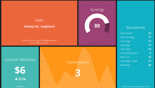
Creation: It starts very simply. “What are our three top priorities or KPIs and how are we measuring them?” A first cut of a dashboard might be as simple as 3-5 numbers, tracked over time. People look at it and say “That will do for now, I guess”. I always think of the dashing demo as a fine example of a dashboard in this stage.
This stage usually lasts only a month or two. It doesn’t take too long before your data consumers start asking things like “Is that number good or bad?” and “How does that compare to last year/our goals/our competitors/industry average/whatever?” So then you move to the next stage…
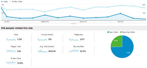
Context: Contextual dashboards are heavy on the line-charts and bar-charts, depending on whether you’re comparing your product to last week or to the competition. The iconic Google Analytics chart has about 130 data points on it and is a pretty good example of a contextual dashboard.
People look at it and say “That will do for now, I guess”. But this level of analysis can take an organization a long way, illustrating trends or market strengths clearly. However, your data consumers realize that these charts aren’t really giving them any idea why numbers are up or down, or why you’re gaining or losing market-share. So they ask “What’s driving this change?” or “How can I tell what segments are we lagging with?” are typical questions after looking at a board like this. So we move to stage 3…
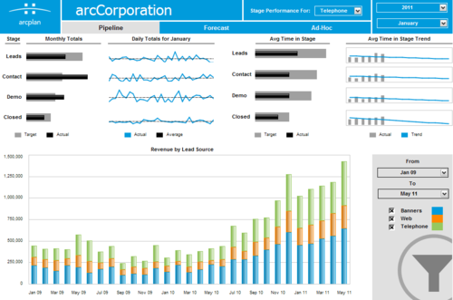
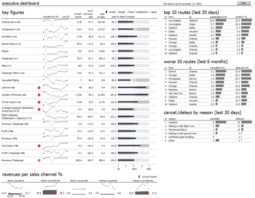
Category: In category or segement dashboards, the constituent parts of your numbers take center stage. Here you’re no longer looking at the company’s top priority numbers from the first stage unless you’re summing up the different groups somewhere. Mostly you’re looking at different groups to see if there are any outliers. I usually see 250 or so data points on these dashboards. To give a sense of complexity, this dashboard is a pretty good example.
This is where you start getting to the point of needing to sub-divide the dashboard into different views. People can only interpret so much data at once. Some data consumers start to tune the dashboard out at this point, instead just coming up and asking about info that’s readily available on the board. Others are really unsure about what is included in one group versus another (ie “When does someone move from lead to contact?” “How do targets fall out of our funnel?”). People who aren’t really paying attention look at it and say “That will do for now, I guess”.
At this point you’re probably better off just burning down to a simpler board. But occasionally, you’ll have data consumers that want the highs and lows highlighted, or some additional number added in. So you move to the final stage…
Chaos: This is the deluxe, extra-coffee-holder-and-seat-warmer version of a board. Here’s one with well over 400 data points on it. Multiple displays of the same data points, sparkline abuse, and tiny type are all signs of a dashboard deep in the Chaos stage.
Only the most dedicated consumer can make it through this. You’re frequently asked about what is going on, what the numbers are, and “Is there a summary or something?”
So you start over. And the cycle begins again.
Can I fix this? Should I fix this?
For a long time, I was frustrated with the amount of time I spent conveying metrics to my team. I have wondered if there was a better way to approach these displays (and I’m sure there is one). But I’ve come to appreciate that cycling my dashboards, while costly in terms of time, is actually valuable in terms of my team’s understanding of what’s going on, for a few reasons:
Avoid Habituation: If there’s an email I get every week, or a monitor I pass every day, after a while I start to tune it out. By shaking things up, I can keep things a little bit fresher and get a lot more engagement from the team.
Easier to Try New Things: With the expectation that the dashboard will be replaced every few months, there is lots of opportunity to look at new indicators and see how they trend over time. I often think that KPI selection is heavily path dependent, so multiple opportunities to look at trends gives you a much better chance of really finding some insight.
Less Sensitive to Criticism: This may be unique to me, but I know that after I work on a project for a while, I get cranky when people nit-pick or ask me to add things. By making each iteration of my dashboard lower-stakes, it’s a lot easier for me to openly and honestly assess what is working and what is not, and the make changes accordingly.
And after all, change is best.