When to Avoid the Subway - PyGotham 2017 Talk

My name is Josh Laurito, and I'm here to talk to you about the intersection of three of my favorite things: python, New York City, and trains.

A couple of quick things before we get started:
One is that this talk is a little more Gotham than Py. I’ll be talking a bit about the tech I used here, but if you’re looking for something that will help you once you actually get to work, you might be happier in one of the other talks.
The code and data for this talk are available on Github if you’re curious.
The full text and slides of this talk are available at my website, blog.joshlaurito.com, so if you want to follow along there or catch up because you were distracted by twitter & missed one of my pearls of wisdom, you can do that. I also have posted a link to this talk on my account: @joshlaurito.
Also, a quick plug: I have a weekly email about the data & analytics community in New York City, highlighting events, jobs, and some of the great posts that are written by members of our community. You can check out the archive at tinyletter.com/nycdatajobs, and if you find it to be interesting, you should sign up.
Ok, on to the talk.

The NYC Subway
Most of us who live in the city take the subway everyday, and the decay of the subway has become part of our normal routine. But for those of you from out of town, let me give you a quick introduction to the system.
The NYC subway first opened in 1904 with 28 stations. This is a picture of the construction of one of the original stations, Columbus Circle, about 4 years before opening.

Today, the system contains 422 stations (as we commonly think of them, the MTA counts more), spread across about 23 lines (depending on whether you include the Staten Island rail and if you differentiate between the multiple ‘shuttles’ or S lines, and if you differentiate between the J & Z lines, which are now the effectively same train).
The system includes about 6,400 subway cars, making over 8,000 trips per day, totalling about 1 million miles per day. With the opening of the Second Avenue Subway this January, there are more than 665 miles of track.
5.7 million people take the subway on an average weekday: in 2016, 1.76B rides were taken.

The map you see inside of the subway stations is actually a very accurate display of the system: other than a general widening out of manhattan, trains move in the direction you see on the map. In general, lines that go North-South are longer than the lines that go East-West. The longest line is the A train, which makes 66 stop along over 32 miles of track.
The Problem

Unfortunately, the subway has been getting worse over the last few years, by almost any definition or metric you’d want to use. The MTA, to their credit, posts a number of different stats online in order to be publicly accountable for what’s happening.
Here is a graph of the On-Time Performance of the lines over the last eight years. A train is considered late if it makes it to the end of its route more than 5 minutes after the anticipated time, or if it skipped a stop. That’s admittedly a pretty strict standard, but the performance is abysmal. The main IRT lines (those are the numbered lines) have on-time performance as low as about 30%. By the way: this chart and all the charts in this presentation were produced using Bokeh. This is my first project using Bokeh, and I’m blown away by it: would highly recommend.
While the MTA, which operates the subways, as well as local buses, commuter rail, and bridge and tunnel operations, should be lauded for making this information available, it doesn’t actually provide us with a lot of guidance around what we can do to make our commutes better, or to make sure we’re on time for things. But the MTA does provide a lot of information that’s updated in real-time or near-real-time: they have a very well laid out developer page with a list of resources, and so potentially we can use it to make better decisions about when we can expect the subway to be working, and when we should leave extra time.
One of the data sources is an XML endpoint that updates with major service change status, updated every minute. This is great for up-to-the minute status checks, but there’s no history stored in an accessible location.

Another source is the GTFS feed. GTFS, which stands for General Transit Feed Specification, is Google’s standard for ingesting transit data.
The feed itself is somewhat difficult to work with, since it requires data to be sent as a Protocol Buffer. Let me take a quick minute to talk about these.

Protocol buffers are a standard for serializing data. They originated as google’s internal standard for storing and transmitting data. They’re most similar to XML in that the data they encode is inside of a highly specified, tree-like structure, but they’re much smaller since they aren’t encoded as text, so they’re appropriate for highly-concurrent applications.

Unfortunately, they are not human-readable and are not at all well suited for doing exploratory data analysis. Fortunately, since Google treats python as the first-class language that it is, the python protobuf library is part of the core protobuf project, so support is extremely good. If you’re considering working with the GTFS feed, I’d strongly consider that you convert all the data to JSON before attempting to work on it.

However, if you do manage to get to the GTFS feed, there are a few issues. The primary one is that there isn’t a lot of historical data: the city started saving this information and kept it up for several months in 2014, but discontinued the project. And you’ll need to find the city’s .proto spec if you’re going to decode the information. It’s available, but difficult to find: I’ve posted a link in the github project for my research.

The city’s implementation of GTFS is kinda wonky. Here’s an excerpt, converted to JSON. Not every train is identified every trip, and stalled trains don’t send any signal, making it very hard to identify when there’s an issue. You might notice if you squint that arrivals and departures are listed with the same time. Also, if we’re hoping to do long-term historical research, the data just isn’t there. One committed civic hacker had a system up to pull in the data, but only ran the server for a bit over a year before stopping. I’ve been pulling in this data every 10 minutes or so, but I don’t want to wait years to be able to start the analysis.

Which brings me to the My MTA Alerting System.
In late 2008, the MTA announced a program to send emails & text messages to subscribers about unplanned service disruptions. This program has been reasonably popular and has been maintained for almost a decade. So as a result, there is a record of every major service disruption on the Subway, the bus system, the LIRR, MNR, and bridges and tunnels.

The great thing about this system is the volume of the data that’s in there. over the last 9 years, the MTA has sent over 450,000 alerts, which are crawlable! Over 100,000 are related to the subways: slightly more are related to buses and the LIRR, which from what I can tell are less reliable systems.

Just to prove it worked, the MTA sent a signed message announcing the creation of the program. This shows the structure of the alerts: they have a title, a message body, a timestamp and a system reference, which tells us which system it’s referring to. All of these have been stored online and are accessible.

Going through the alerts when you aren’t trying to go anywhere is actually a lot of fun. As someone who’s lived here for a long time, lots of things that I’ve lived through and seen are encoded here. Most long time New Yorkers will recognize this alert as relating to the night when all the Thanksgiving Parade balloons get blown up, which most long time New Yorkers will also tell you is the one of the best things to see in New York.

Also, like you’d expect from such a large corpus, you’ll see all sorts of weird and non-intuitive messages. This one is one of my favorites. I initially thought this was referring to some lesser known catholic feast, but I can’t find any reference to that, so I have no idea what was happening.

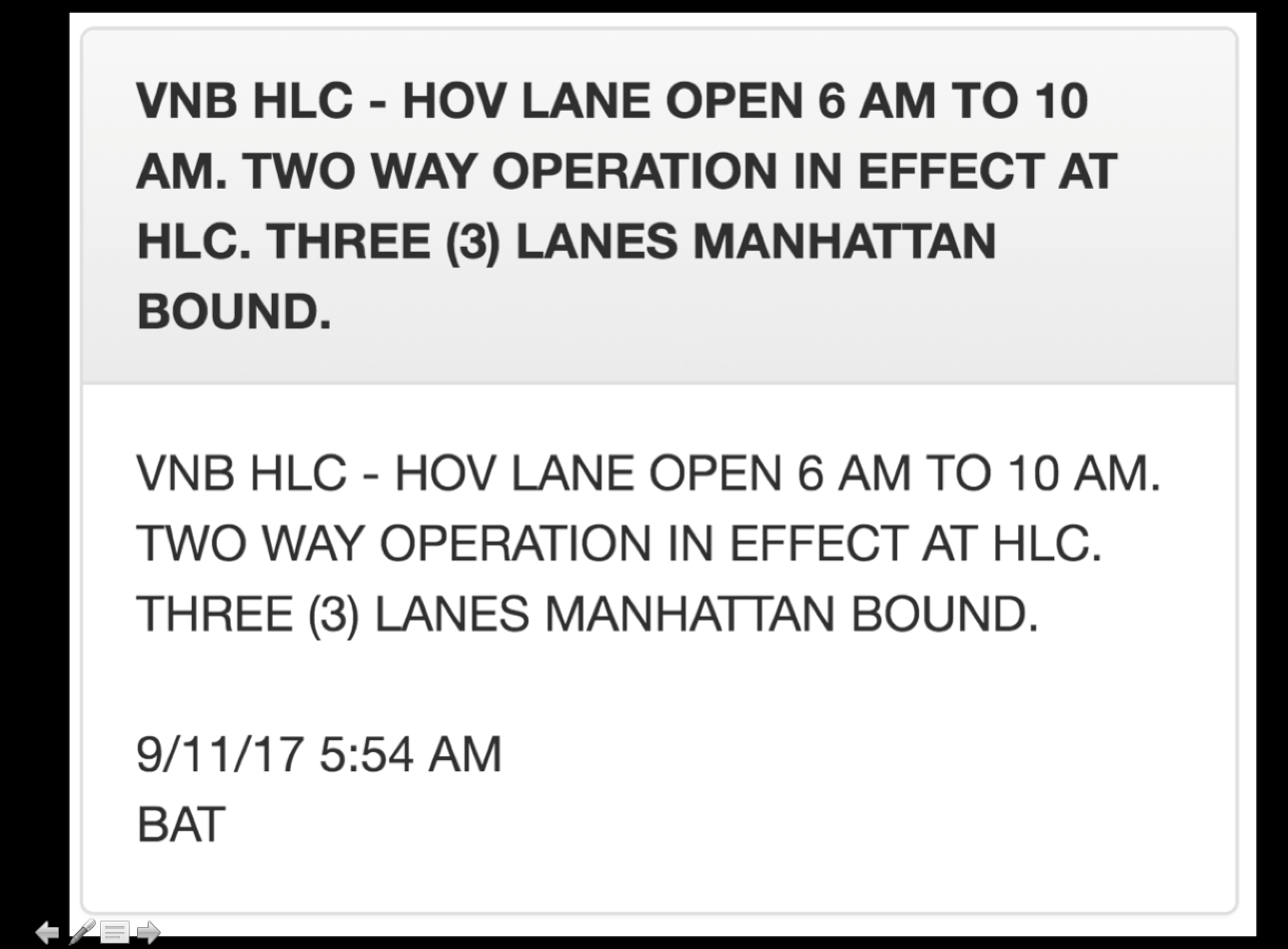
Probably my favorite thing about the alerts, though, is that inexplicably the Bridge & Tunnel alerts are always in all caps. Which is just perfect.
Anyways, so, on to the Python part of this. I built a simple web-scraper to pull all of these alerts down, with an initial pull going about 3 years back: I engineered a number of features, primarily to help me extract which lines are impacted by each alert, and whether the alert was new or an update, whether it was letting people know about a planned change or an unplanned emergency or a non-service change, like the elevators being broken.
After cleaning the data, we want to do a quick sanity check on whether the data we have is any good. So I looked at the relationship between these alerts and the ground truth over the last 3 years: MTA’s on-time performance. So this a chart of on-time performance vs. the number of disruptions. Number of disruptions is on the x axis, and the on-time performance is on the y axis. The number on the charge is the coefficient of correlation, or R-squared.
Fortunately, the relationship between these variables is extremely strong! Across the 20 lines that have been under continuous operation, the average correlation between the number of alerts and on-time performance is about -0.5, and all trains but one have the expected relationship of more disruptions = more delays.

The two major exceptions to this trend were the R & 6 trains, which required some investigation. The R train underwent 2 major changes to service over the 3-year time-period. Before fall 2014, the R had operated in two distinct sections for over a year as repairs were made on the Montague tunnel. Then, late last year, late-night R service was extended to Whitehall street, which allowed the R to avoid some problem spots in queens. You can pretty clearly see the impacts of the service changes on the R.

I don’t have as clear of an explanation about the 6 train, and why it’s an outlier. I believe this is due to the 2nd avenue subway line opening early this year, which was primarily designed to take pressure off the 6. So while the rest of the system has gotten worse this year, the 6 is slightly better. As a regular rider of the 6 train, that seems like a reasonable explanation. An alternate hypothesis would be that *no matter what happens in the system, the 6 will probably be late*, which I have to admit is also a pretty compelling theory.

Looking at system-wide disruption also gives us a nice way to measure the system performance on a day-by-day basis. Here’s a graph of day-by-day performance in terms of the average number of disruptions, along with the 28-day moving average. You can see some spikes in the winter, which after investigation, I can tell you are due to snowstorms.

At this point, we need to do some more classification. I engineered some additional features to try to get at the cause of each alert. Fortunately, Scikit comes with a ton of classification tools: I used a decision tree on top of some heavily engineered features, and then I manually classified a little bit over 1,000 alerts to train the model, and then validated on an out-of-sample selection, which was classified with 96.9% accuracy.

So now we can look at the performance of the subway over the last 36 months, with the impact of bad weather pulled out. Like before, this is the daily number of disruptions, with the 28 day moving average in bold. We can see pretty clearly that the system has been dealing with more disruptions, jumping from an average of about 15/day over the last few years, to about 22 since late last year. That’s roughly a 50% increase in disruptions. We aren’t just imagining things, the trains really are worse.

So now that we’ve identified weather as driver of performance, we can look at how precipitation impacts the trains. I pulled daily weather information from NOAA and regressed it against performance. The relationship is rough linear, and every inch of precipitation results in about 5 additional disruptions per day, or the first inch of rain leads to about a 30% increase in disruptions compared to a dry day. The relationship isn’t incredibly strong though.

There’s a much stronger relationship when we look at snow: here we see that each inch of snow leads to about a 10% increase in disruptions compared to a dry day. I also took quick looks at cold and hot weather: there’s a slight association between cold weather and delays, nothing meaningful for hot weather, though.

So one cool thing that also comes out of this is this is that we can now see a breakdown of all the causes of delays on the subway to a fairly high level of accuracy. So here’s my obligatory jupyter notebook screenshot/reference. Excluding some delay types we don’t care about, like non service announcements, on an average day, over the last three years, the system sees about 18 disruptions per day. The most common causes of delays are general equipment problems and signal and switch problems. Sick customers, police activity, and maintenance make up the other very common disruptions.
If you’re reading closely, you’ll notice that I’m breaking out ‘end of disruption’ alerts separately: occasionally the city will only announce a disruption after it has passed, which I am classifying slightly differently.

Anyways, another nifty thing we can see here is a relative ranking of how bad each disruption is, estimated by the number of alerts & updates that get sent for each one. The MTA sends updates roughly every two hours for ongoing disruptions, so as a very loose rule of thumb, I think of every update as representing an issue open for two additional hours. You can see that ‘construction’ is far and away the worst, which might be confusing, but what I mean here is road construction impacting shuttle buses. So these are situations when you’ve already transferred to the bus, and then the bus is rerouted by construction, as you can see in some selected messages on the right.
Unplanned service changes, weather disruption, and accidents (which usually mean someone hit by a train) take a long time to resolve. Sick customers don’t take too long to get off the system though.

So finally we’re really in a place to think about when to avoid the subway. The first thing I looked at is when the most disruptions occur. Here’s a heatmap: darker colors mean more disruptions. Turns out that the worst time for the system is Monday morning, between 8 & 9AM. On weekdays, disruptions primarily happen between 6 & 10 AM, and between 3 & 7PM in the afternoons. Fridays are by far the easiest day of the week.

Putting this data another way, on Monday mornings, there is an 80% chance that there will be a disruption somewhere in the system in any given hour. That falls to about 20% by the middle of the night.

Pretty clearly, there is a direct correlation between the number of people on the system and the number of disruptions. This makes sense for a lot of disruption types, like sick passengers and overcrowding, but also applies to things you wouldn’t expect. Here’s the chart for equipment problems by hour: you’ll see that though we wouldn’t necessarily expect equipment to always break down during rush hour, our disruption announcements do. This gives me some level of concern about the quality of the dataset, though if we’re missing slight disruptions that happen late at night I think I can live with that. I mean, if a train stalls in the middle of the night and no one is on it, does it really create a delay?

Unfortunately, since most of the disruptions follow a very similar pattern of being worse early in the week and in the morning, there isn’t really much to say about the relatively likelihoods of each of the delays. There are two exceptions though:
Maintenance windows clearly happen off-hours. Even when the MTA needs to do unplanned work, they obviously strive to avoid working during peak hours.

The other main exception is with sick customers. It’s a little hard to see, but sick customer delays become more common later in the week, with Thursday and Friday afternoons being slightly heavier than earlier in the week. On Fridays, every hour from 1PM to 7PM, there’s about a 20% chance that there’s a sick passenger causing a delay on the system somewhere. I’ll leave it as an exercise to the audience to figure out why.

We can even go a little deeper and see which disruptions are likely to happen on each line. Here’s a heatmap of disruptions by line for the major causes of delays. While again we see the same pattern in the data, there are some identifiable differences. Delays on the L are dominated by equipment problems, and the very similar 7 train deals with the same. My 4/5/6 deals with sick passengers the most, maybe because it serves the Bros of Murray Hill (which I say with love, having been one). The F train in particular suffers from signal & switch problems, while the J/Z, G and 1 trains seem to be pretty reliable day-to-day.

Probably the most interesting thing I’ve found so far, though, and what I’m continuing to research, is how delays cascade throughout the system, from one train line to another. Obviously trains that run on the same line will share a lot of delays: if there’s a problem with the 4, it will usually impact the 6 in some way. However, in the outer Boros, there are a lot of trains that run together differently than they do in Manhattan. As a result, from a Manhattanite’s perspective, there is some ability to predict issues on what seem like unrelated lines. The E & F, for instance, don’t run together at all in Manhattan, but they do share a line in Brooklyn. Fairly often, when there’s an issue with one of them, the other will reflect this and will be disrupted not long after, and this does have some predictive power.

Unfortunately, that’s about as far as my research has taken me, as of now. I continue to look at different ways to model expectations of delays, but currently I haven’t been able to do better than about 30% accuracy, as measured by correctly predicting which line will have an incident in a given hour. It is the final irony of my work on the subway that I’ve spent hours on it, going nowhere or slower than I hoped.

Still I promised to give you some advice that you can use to make your commutes slightly better. And I do have the data to give a few simple pieces of advice. If you’re going to choose a day to stay home bc you can’t stand the commute, always choose Monday. If there’s an unplanned service change, stay away from the line for the rest of the day, but stick around if there’s a sick passenger or police activity: those resolve quickly. If you can stay home when there’s more than about 2 inches of rain or 5 inches of snow forecast for the day, you probably should.

And definitely sign up for alerts: if you can’t know about delays ahead of time, at least you can know about them in real time.
Thanks a bunch for listening, and safe travels.